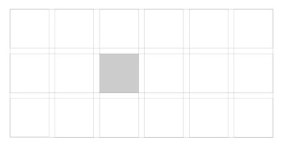
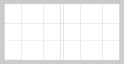
Grid:
- A Grid is a Consistent system for placing objects.
- They create structure and organisation for data.
- Used in print publication and to develop advertisements.
- Specified guide for how to place text, photos and advertisements on the page.
- Thus, Layout grid provides visual harmony and consistency.
- It is the invisible force that gives the visible structure and holds everything in its proper place.
Anatomy of Grid:
- Below are the different elements that compose a grid.
Columns:
- Columns are the vertical sections of a grid. The more columns in the grid the greater its flexibility.
Rows:
- Modules are units of space that are created by the intersection of rows and columns.
Regions:
- Margins are the space outside of the grid columns and rows.
Flowline:
- Flowlines are typically used to break up sections of a composition. They create natural stopping and starting places in the design.
Marker:
- A marker is the area that secondary content is placed. Books common house chapter titles, page numbers, etc. in the marker area.
Grid Types:
- There are mainly four types of grids as follows
1. Hierarchical:
- The hierarchical grid is an intuitively constructed grid that focuses on the proportions of the elements in the design.
- This type of grid is often used when the content isn't standardized and repetitive.
Example:
- Hierarchical grid commonly found on the web.Useful for clean layouts such as web templates.
2. Manuscript:
- The manuscript grid is the oldest type of grid used in print media. It typically presents itself as a standardized rectangle that contains the content on a page or screen.
3. Multicolumn:
4. Modular:
- While a multicolumn grid splits a page vertically into a number of columns, a modular grid subdivides a page both vertically and horizontally into modules.
- The columns and rows and the alleys between them create a matrix of cells, or modules.
- Modular grids are good when you require more control over a complex layout than a column grid can offer.


